For this first round of building my thesis, I focused on how game-like my UI should be for my 3D social media site. Modern 2D web interfaces have strict rules around spacing and alignment, but having a 3D site means having to fuse those rules with how people usually navigate 3D worlds: video games.
From last semester in Shared Minds, the biggest feedback I got on my site focused on navigating the Network view. It’s the first thing people have to encounter after they sign up for the site. A lot of people were confused on what exactly they were seeing at first, and I don’t blame them.
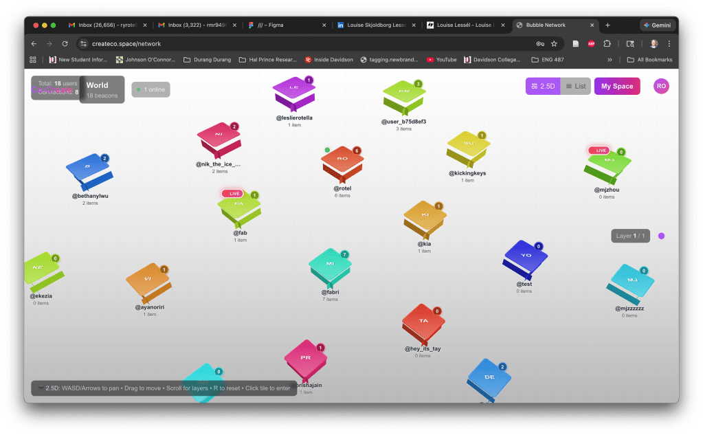
I was going for an isometric view of tiles on a game board. But these vague polygons weren’t really providing people with a clear intuitive sense of exploration. On the 2D web, a user knows the webpage they’re visiting by function/text: a portfolio, a video streaming site, a bank, so on and so forth. With 3D and video games, users are thrust into a world so it’s on the designer to build a world that has a proper diegetic environment nudging the user on what to do. In Grand Theft Auto, a user is in a city. In Minecraft, a user is placed in a forest or beach.
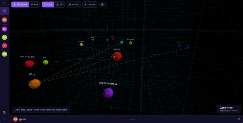
Therefore, in this round of user testing, I want to place users in Space. I want users to pilot the camera and visit each person’s world, which are represented as planets. This plays into a more skeuomorphic design that communicates to the users more literally with what symbols represent, a la the old iPhone. Bloomberg had a good writeup here about how AirBnb, Apple, and others are starting to embrace skeuomorphism again but in 3D. With my site, each person’s space is a planet of their own making, for visitors to discover who they are by what they assemble and arrange.
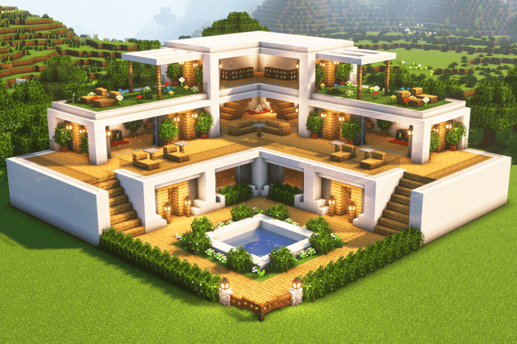
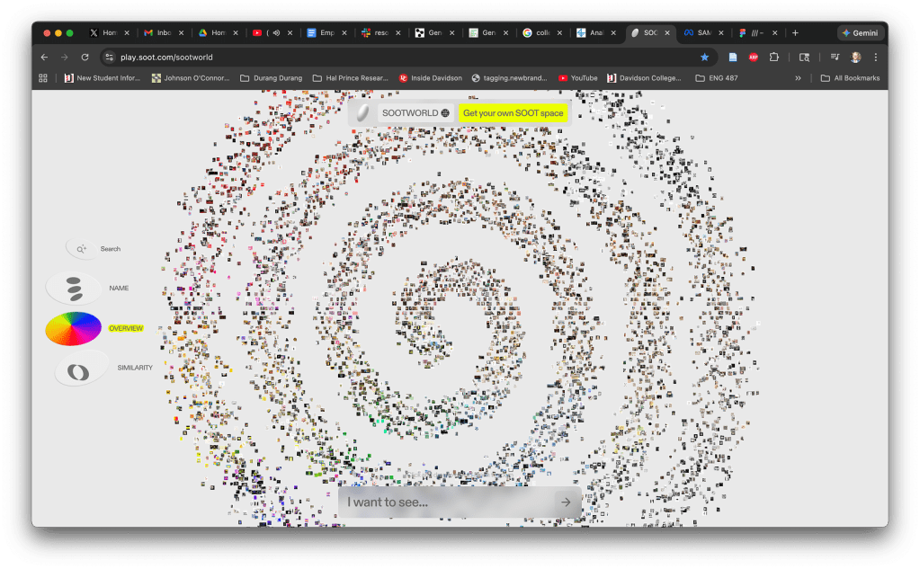
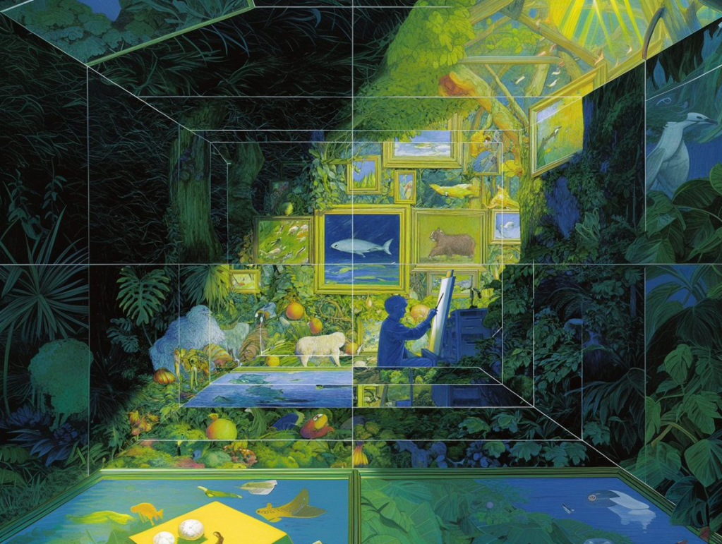
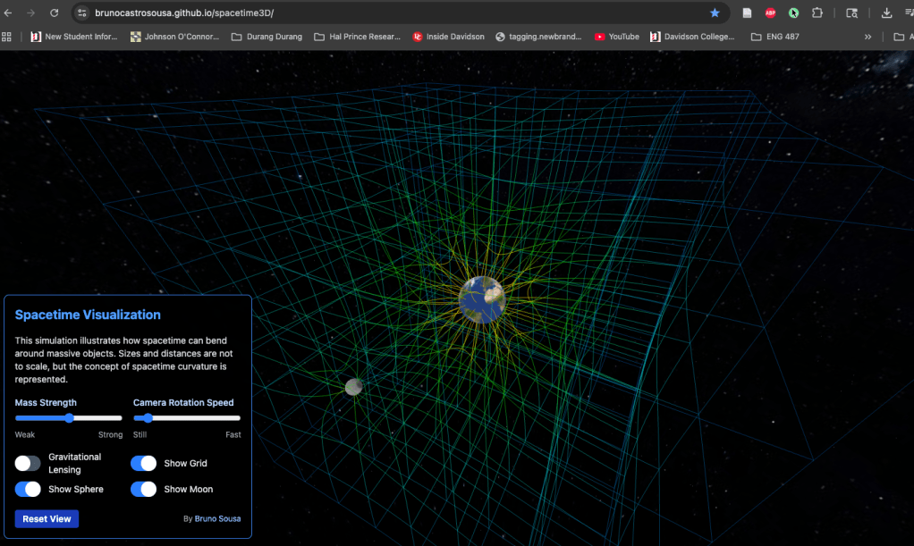
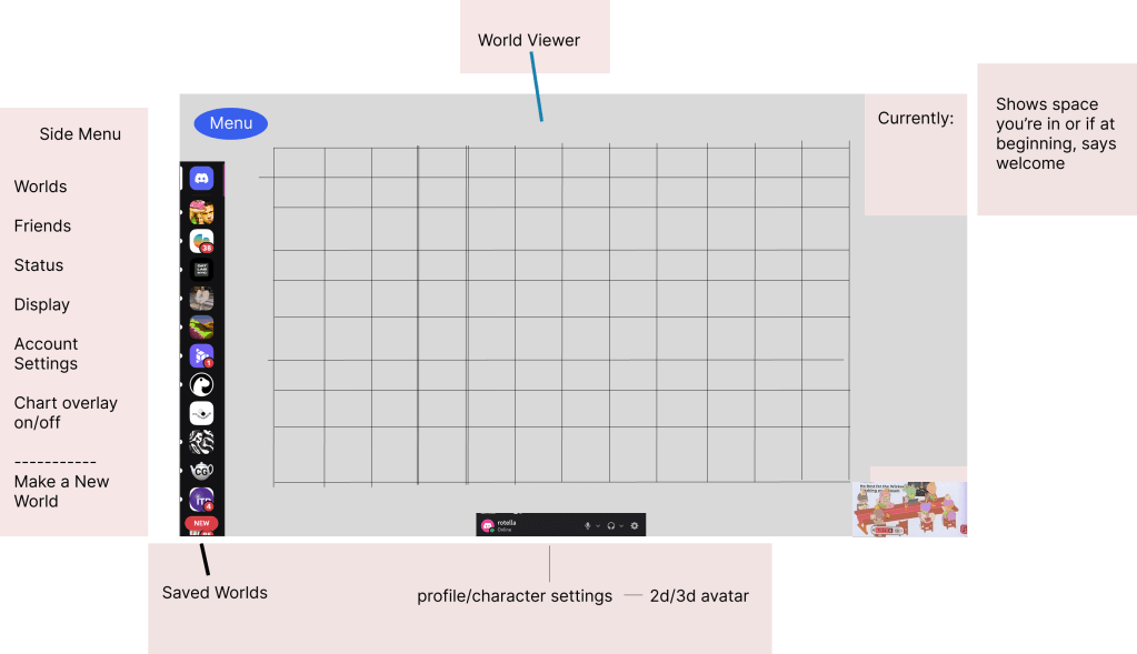
First, I used Figma to gather inspiration for concept art for my site. Through my research, I focused on Minecraft, SOOT (a site that has users navigate images through the Z Axis), art from the Poet Engineer of space and depth, and a wonderful spacetime visualization made by Bruno Sousa which I stumbled upon in Googling. I also took inspiration from the Discord menu, particular its use of side and bottom bars for quick access to settings while still allowing the main window to be seen easily.
Here’s a rough mockup I made in Figma.
Below is what I made in my sessions with Claude Code.
I still have progress to make on this front, especially as I add more elements. I talked to my fellow ITP student and friend, Omi Bahuguna, who also works in the Design Lab. He had some great feedback and this prompted several questions based on our conversation.
Each world representing a person and their identity makes a lot of sense. How do I show group worlds as objects? Should they be the same as a person’s or should I make them represented differently to distinguish group identity from individual?
As I introduce private groups and public communal worlds, how do I establish undiscovered group world locations in the view, i.e. where to render it in space? How do I recommend cool stuff to people that doesn’t entail tracking their data?
Omi also told me it’s important that my site doesn’t have to do everything. I can leave discovery of content to the Main Internet, and my site can be a curation garden of sorts where people are free from scrolling and bots (hopefully).
In order to establish the world of my site, I need to establish what my website’s main mechanic and have that present from the beginning. I think I want it to be creation/design of worlds. So for the coming weeks, I will focus much more on how to build and decorate inside individual worlds. I really need to nail down those mechanics if I want users to feel liberated to create on the web again with play and purpose.

Leave a comment